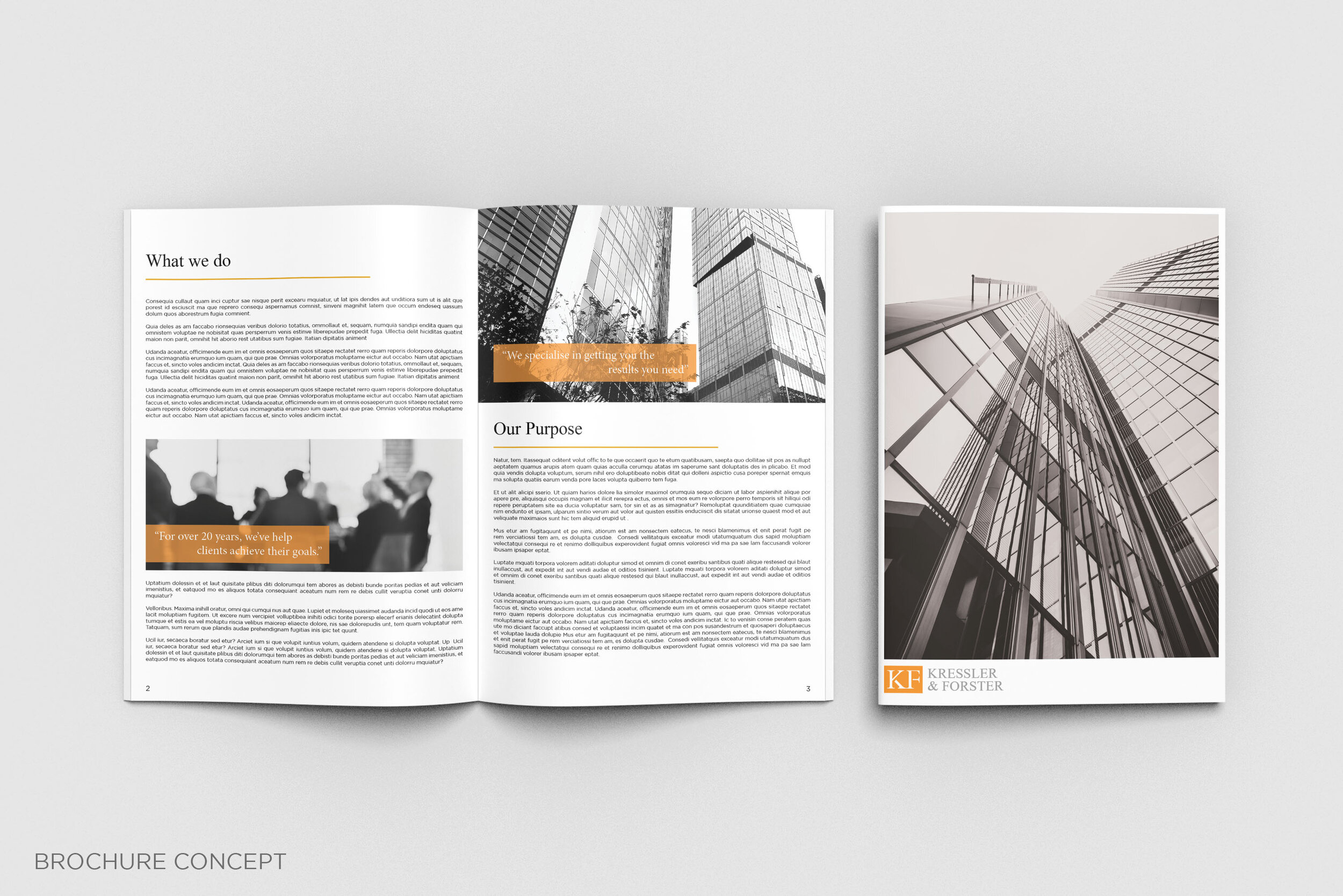
Company Re-brand of an Investment Practice Kressler & Forster.
Adobe Illustrator
Adobe Indesign
Adobe Photoshop
This was a re-brand concept of an Investment Practice called Kressler & Forster. The goal was to take the original logo of Kressler & Forster and re-brand it to suit a corporate environment and to appeal towards a wider market audience.
For my approach; I’ve created a re-haul for the font, using a more friendly, polished and professional font to match with today’s current corporate environment.
While the general colours were maintained for brand continuity, both the grey and orange were re-introduced as a lighter tone, again to convey across a polished and professional company for today’s work environment.


